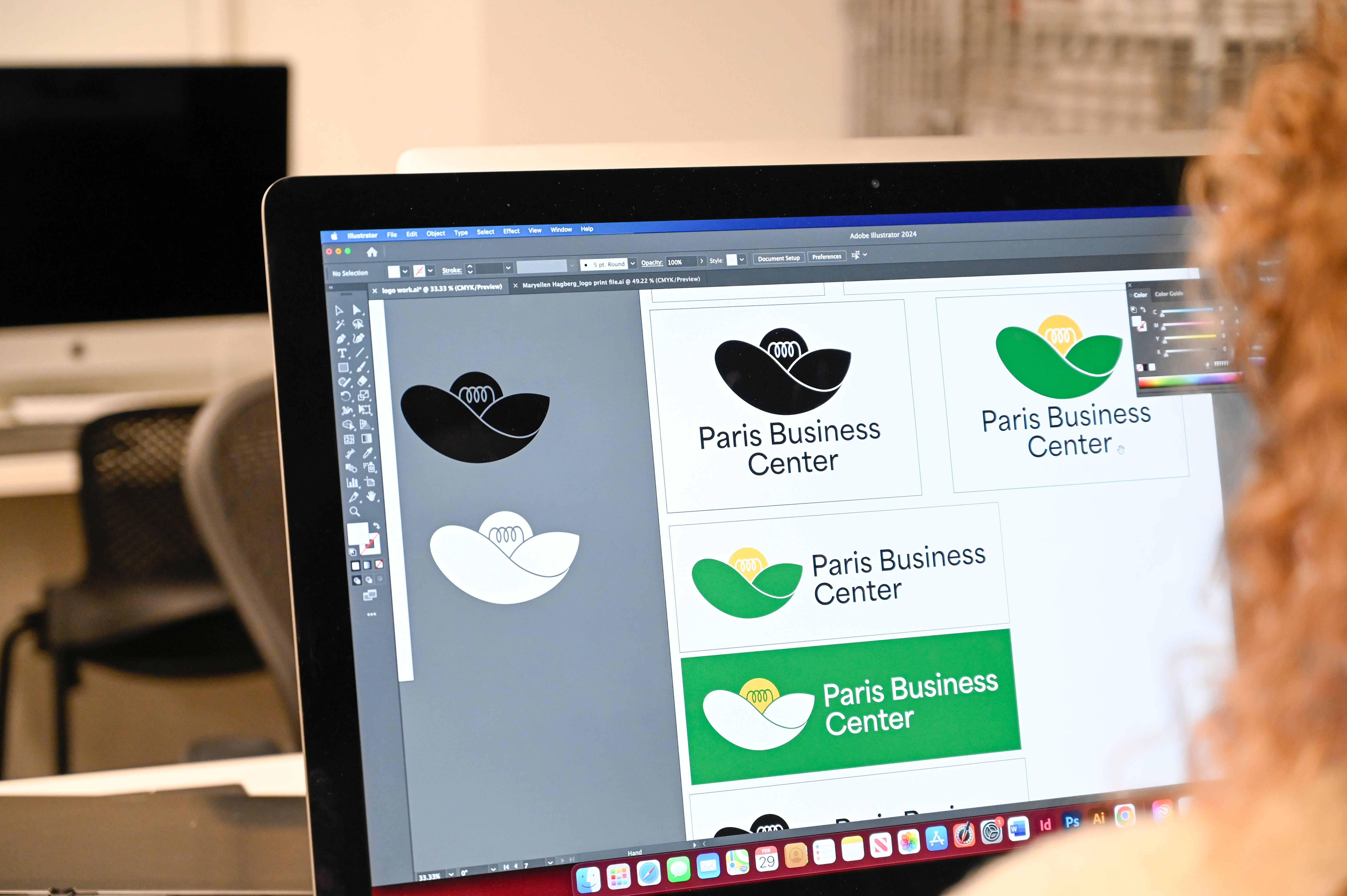
Graphic art student’s winning logo design used by North Georgia business
 W
hen city officials in Hiawassee, Georgia, needed to boost one of their local businesses with a new logo—they did something ingenious.
Rather than hire a graphic design company, which could cost up to $25,000 for a single creation, they held a competition for graphic art students enrolled at any of Georgia’s public and private colleges and universities. By doing so, they lowered their own costs while giving students a real-world experience: an opportunity to design a logo used by an actual business.
Many took up the challenge. But only one was chosen.
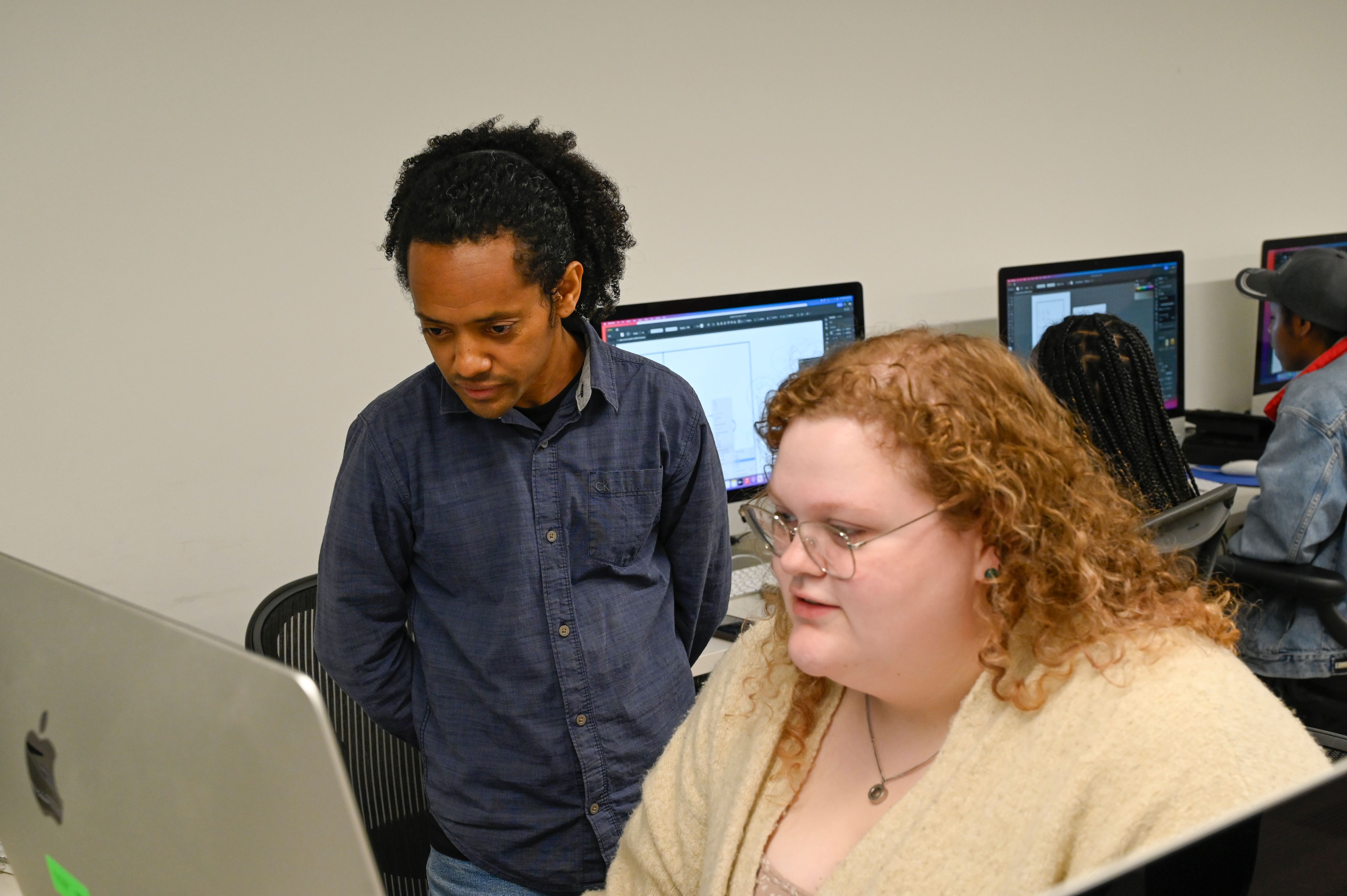
Georgia College & State University junior art major Maryellen Hagberg of Dalton, Georgia, won the grand prize of $1,000.
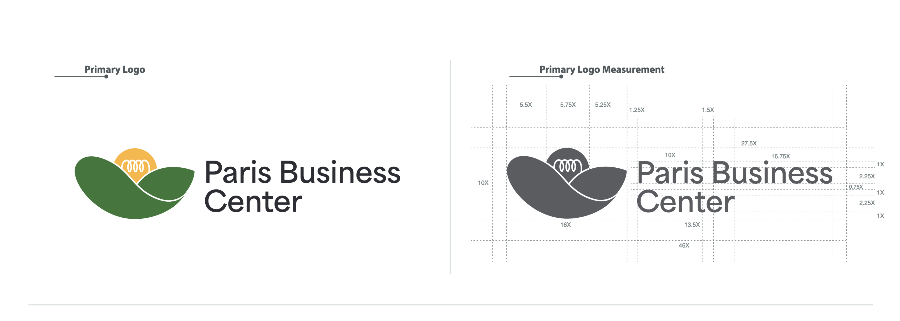
The lightbulb signifies ideas, while green hills represent the rural mountains in northeast Towns County. Hagberg’s logo neatly complements the town’s own logo of a sun peeking ’round a blue mountain over green valleys.
“Your design stood out among many impressive entries for its creativity, elegance and strong representation of the Paris Business Center's brand identity,” wrote Tyler Osborn, co-chair of the Hiawassee Downtown Development Authority, when congratulating Hagberg.
“We were particularly impressed by the unique use of incorporating the lightbulb into the sun and the creativity of designing the mountains,” he continued. “Your contribution will play a significant role in shaping the visual identity of the Paris Business Center, and we are excited to begin incorporating your design into our branding materials.”
This is real, real-world experience. Her win can be used as a motivation. Because now, when there is another opportunity, students will be encouraged to participate, knowing a fellow student has won one.
As an alternative, students could enter the Hiawassee competition to deal with the problems of a real company and design a logo that would be publicly displayed.
Hagberg was one of three students in the class to enter the competition.
“This opportunity came up at the same time,” Abebe said, “which is good. This is real, real-world experience. Her win can be used as a motivation. Because now, when there is another opportunity, students will be encouraged to participate, knowing a fellow student has won one.”
An associate professor of art, Abebe has provided students with real-life opportunities in the past. His graphic art students designed a postcard for University Advancement and a logo for the Milledgeville Museum Association. He’s always looking to collaborate with companies and organizations, hoping they’ll take advantage of the talent within his classrooms.
A logo should be simple, recognizable but at the same time carry uniqueness into it.
Hagberg was able to accumulate all that into one, simple but powerful design.
“A logo has to be simple,” Abebe said, “because when you see it, you have to recognize it. That’s the reason they chose this one. A logo should be simple, recognizable but at the same time carry uniqueness into it.”
Abebe gave the class guidelines to follow.
Then, Hagberg delved into researching her very real client. Her simple logo is deceptive. It took weeks of finding information, contemplating what her clients wanted and turning their needs into something lasting and rememberable.
She wanted to understand the social and economic impact of the business, what it was trying to accomplish and its value to the community. It was difficult expressing all those in one design.
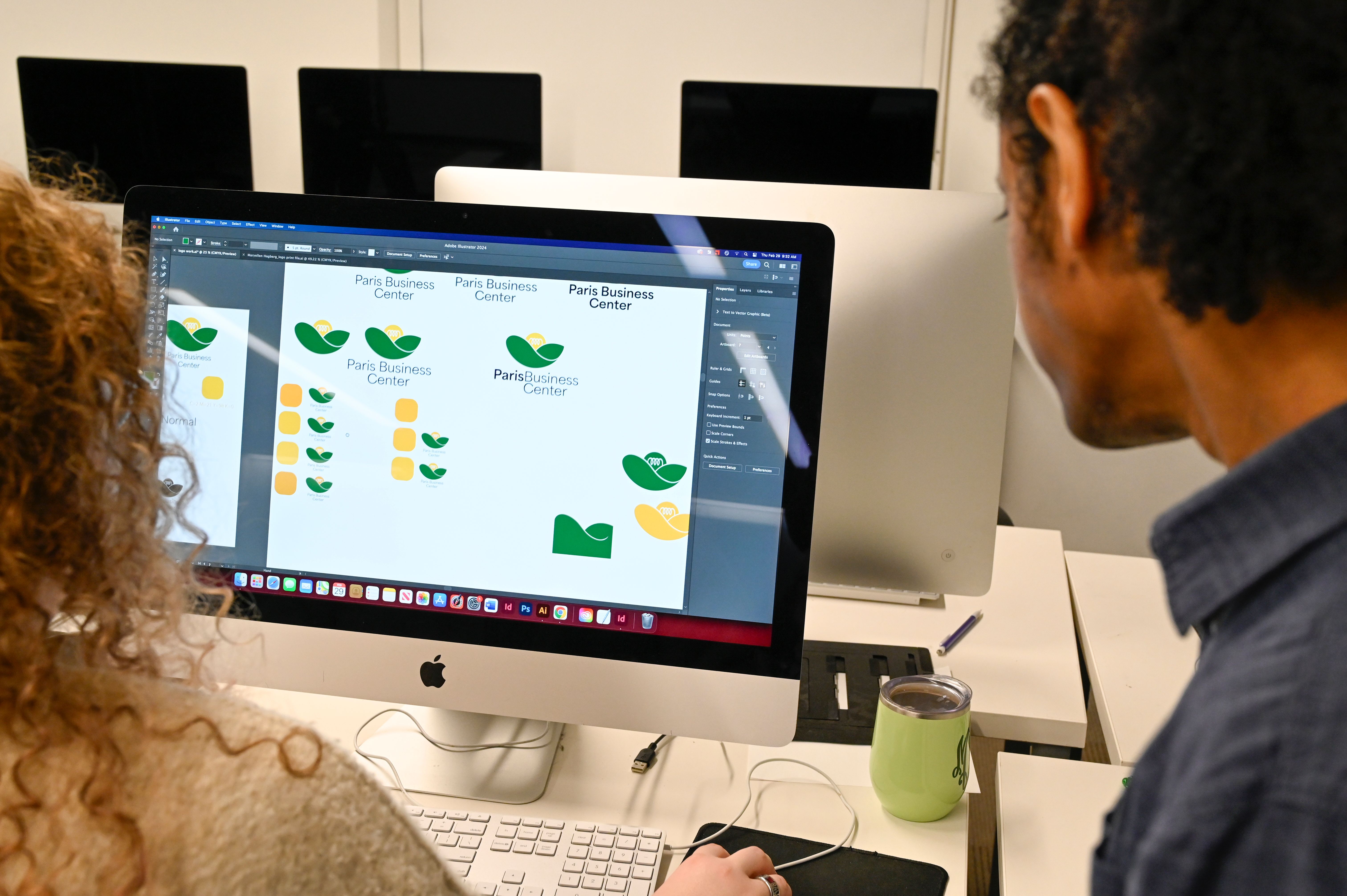
It’s a pretty intricate process to give simple-looking results.
“The research I did showed me they really valued nature,” Hagberg said. “You have certain guidelines students have to follow when they design a logo, mandatory elements. But you can add in optional elements, as well. We can add our imagination into the design.”
When Hagberg felt stuck, she turned to Abebe. He asked questions, encouraging her to explore different ways and ideas. He never did the work for her. So, at the end, Hagberg could be especially pleased she earned first-place herself.
In many graphic design classes, it’s easy for the professor to just show you how it’s done. Particularly in Abebe’s classes, he’s really good at helping us foster ideas and development from scribble into something that looks professional. That will really be helpful in my future.
 Abebe also teaches career-related knowhow—like negotiating a contract and how students should interact with clients. He gets into legalities, copyrights and intellectual property.
Because of this, Hagberg feels ready for a job doing freelance graphic design or branding work.
“My job is just guiding them,” Abebe said, “They have to process the design. Otherwise, they will be dependent on me. I want to be able to say, ‘This is completely yours.’”
“I try to help them solve problems without dictating the idea of it. The idea shouldn’t be mine,” he said. “My support is going to be how to execute their ideas, how to push their ideas further by using certain design techniques and methodologies.”
Every line, however thick or fine, was purposely placed in Hagberg’s logo.
She can explain each step, each change and the reasons behind them. She considered how weighty the logo should appear. She wanted it to be like “infinity,” showing a shape that gives the impression of “coming back around.”
Her mountains seem like a bowl, holding the company’s ideas.
“When you design something like this, you want the eye to lead you through the curves,” she said. “I wanted it to be seamless and natural. There are no kinks or funky edges.”
Once she had the logo, Hagberg built in options for the company to use, while remaining true to her design. These includes various colors, shapes and sizes, so the logo can be used on small items like stationery, cups and clothing to enormously big billboards.
This is the first logo I ever did. I’ve never actually had anything commercial reproduced. The fact that it’s going to be used by a real company—yeah, it’s pretty exciting.
“It was a little weird,” she said. “I wasn’t sure it was real. This is the first logo I ever did. I’ve never actually had anything commercial reproduced. The fact that it’s going to be used by a real company—yeah, it’s pretty exciting.”
When Hagberg chose to major in art, she broke the mold so-to-speak. Her family has a few chemists in it. People always ask what she’ll do with an art degree.
After taking Abebe’s graphic design classes and winning the Paris Business Center logo contest, Hagberg knows she has a working future in art. She plans to pursue a masters in graphic design.
For research this year, Hagberg also designed an app that helps people reduce food waste by keeping track of what’s in their pantry and fridge.
She credits Abebe and his wonderful training for her successes.
As for Abebe, he was always confident a student of his would win the logo contest.
“Definitely, I was confident,” Abebe said, “because my students work really hard. This will give Maryellen a step up. Not many students have the experience of making a real logo for a real company before they graduate.”
This is great recognition for her—hands-on, professional experience that has real-world value.
Update: Professor Abebe recently earned a major accolade of his own. The graphic design professor is a 2024 winner of the TDC competition. Established in 1953, the Type Directors Club Awards is the longest running, most prestigious global typography and type design competition. The awards are all about how letterforms are used and drawn, recognizing typographic excellence and celebrating new typeface designs in all global languages. Abebe's winning typeface - November Ethiopic - can be seen here.

Learn more about the Distinguish Pillar in our Imagine 2030 Strategic Plan
